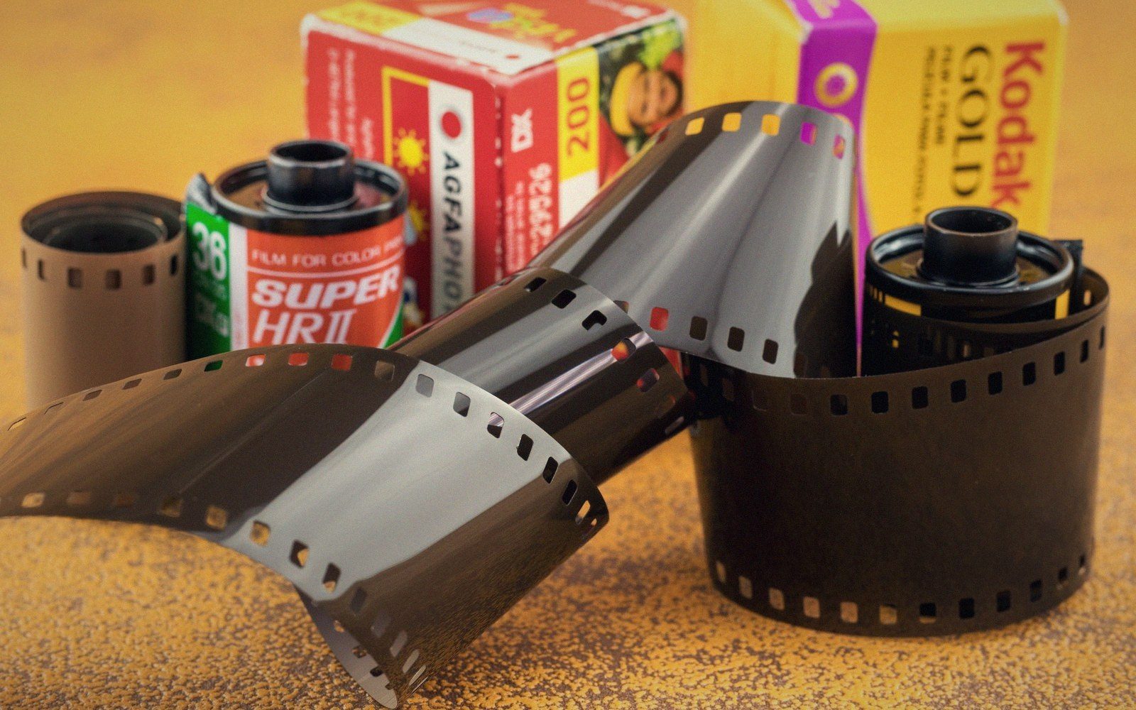
How the layers work
A colour negative or transparency film is a stack of three emulsion layers, each sensitised to a different third of the spectrum — blue on top, green in the middle, red beneath — separated by thin filter layers that stop blue light reaching the lower two. Expose the film and each layer records its own latent image. Development converts that silver record into a dye: cyan where red light fell, magenta where green fell, yellow where blue fell. Superimposed, those three dye clouds reconstruct a colour image.
The chemistry that makes the dye is called a coupler, and where it lives determines the process. In Kodachrome, first introduced by Eastman Kodak in 1935, the couplers were in the developer solutions, not in the film itself — three separate colour developers were applied in a precise sequence during processing.

This made Kodachrome extraordinarily stable: the dyes it produced were among the most archivally durable of any colour film, but the process demanded a tightly controlled industrial laboratory. When Kodak ended Kodachrome production in 2009, the chemistry went with it.
Virtually every other colour film — Kodak Ektachrome, Fujifilm Velvia, Agfachrome, the whole range of C-41 negative stocks — uses a different architecture: the couplers are incorporated directly into the emulsion layers at manufacture. Development is simpler and the process is standardised, which is why any C-41 laboratory can handle any C-41 negative. The price is that colour stability depends on the specific dye molecules chosen, and that choice is also where each film's character lives.
The voice of the stock
Film manufacturers tune their emulsions for particular colour biases, saturation levels and contrast curves, and those choices are repeatable across every roll from the same batch. Fujifilm Velvia 50, introduced in 1990, amplifies greens and reds into near-chromatic excess — the saturation is a deliberate engineering decision, not a printing accident. Kodachrome's palette ran warm, with strong reds and a characteristic shadow density that gave it its graphic weight. Kodak Portra, designed for skin tone, is desaturated by comparison, with a long, forgiving shoulder on its characteristic curve.
These biases arise from the dye coupler chemistry and from the spectral sensitivity curves of each layer — the precise range of wavelengths each emulsion responds to. Change the sensitising dyes on the silver halide crystals and you shift which colours read as bright and which fall away. Every film stock is, in this sense, an argument about what colour should look like.